On October 6, 1978 the original Board of Directors for SSP met in the Conference Room at the American Geophysical Union. One item discussed was the approval of a logo to represent the newly formed Society.
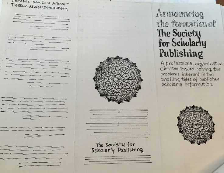
Following is the hand-drawn logo that was proposed:

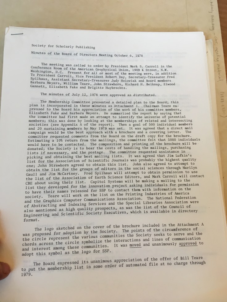
The approval of the logo was unanimous! The meaning and symbolism behind the logo were detailed in the meeting minutes:
The points of the circumference of the circle represent the various communities the Society seeks to serve and the chords (sic) across the circle symbolize the interactions and lines of communications and interest among the communities. It was moved and unanimously approved to adopt this symbol as the logo for SSP.

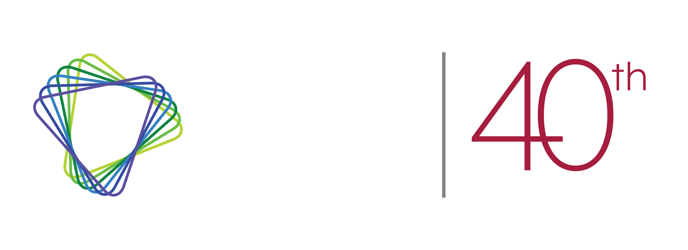
Flash forward to May 2017 when SSP updated to its current logo:
The new logo’s design carries on the original themes while reflecting the society’s position as a forward-thinking and innovative space in the publishing community.
The logo may change, but the commitment stays the same!
Note: The documents used in this post were obtained from the AIP’s Niels Bohr Library & Archives in College Park, MD.


Leave a comment